Redefining relocation.
As the world gets smaller and businesses expand into new territories - Sanelo serves as the go-to relocation expert, ensuring professionals effortlessly settle in new neighbourhoods worldwide.
Beyond basic logistics, their premium service encompasses intricate details like visa arrangements and childcare setups. Their existing brand identity didn’t reflect the high-quality, expert-driven nature of their services.

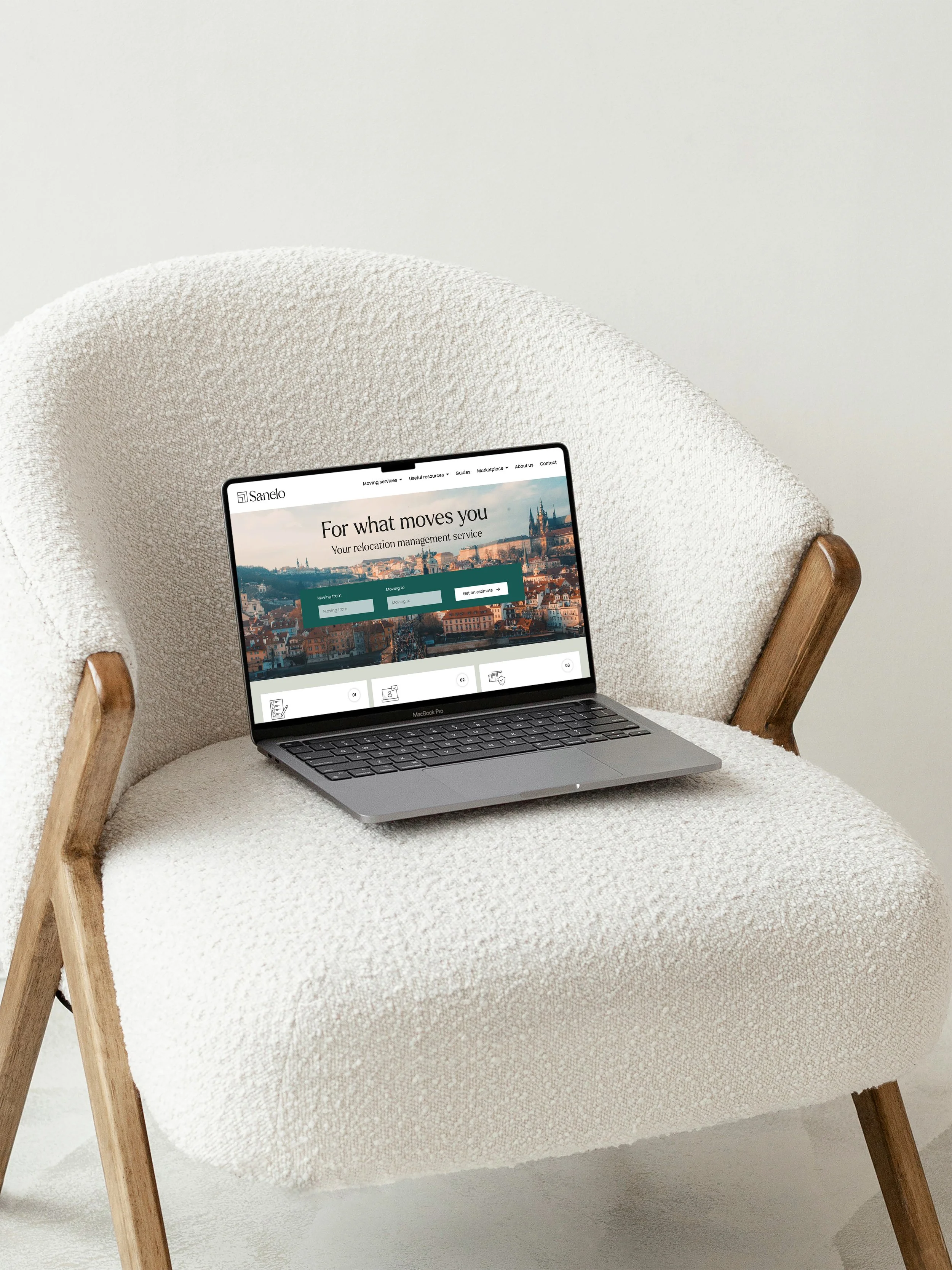
We identified the key pain points for people when it came to relocating and discovered an interesting but not unsurprising trend; lack of connection to their new neighbourhood. We used this insight to position Sanelo as more than a logistics company - they’re an expert person on the ground, a local who can show you the best coffee shops or how to find a school for your kids.
We crafted the new Sanelo brand identity to fit seamlessly into the lifestyle of today’s modern professional. For people who are used to concierge services, luxury hotels, and fine dining, we’ve elevated Sanelo to match that level of quality.
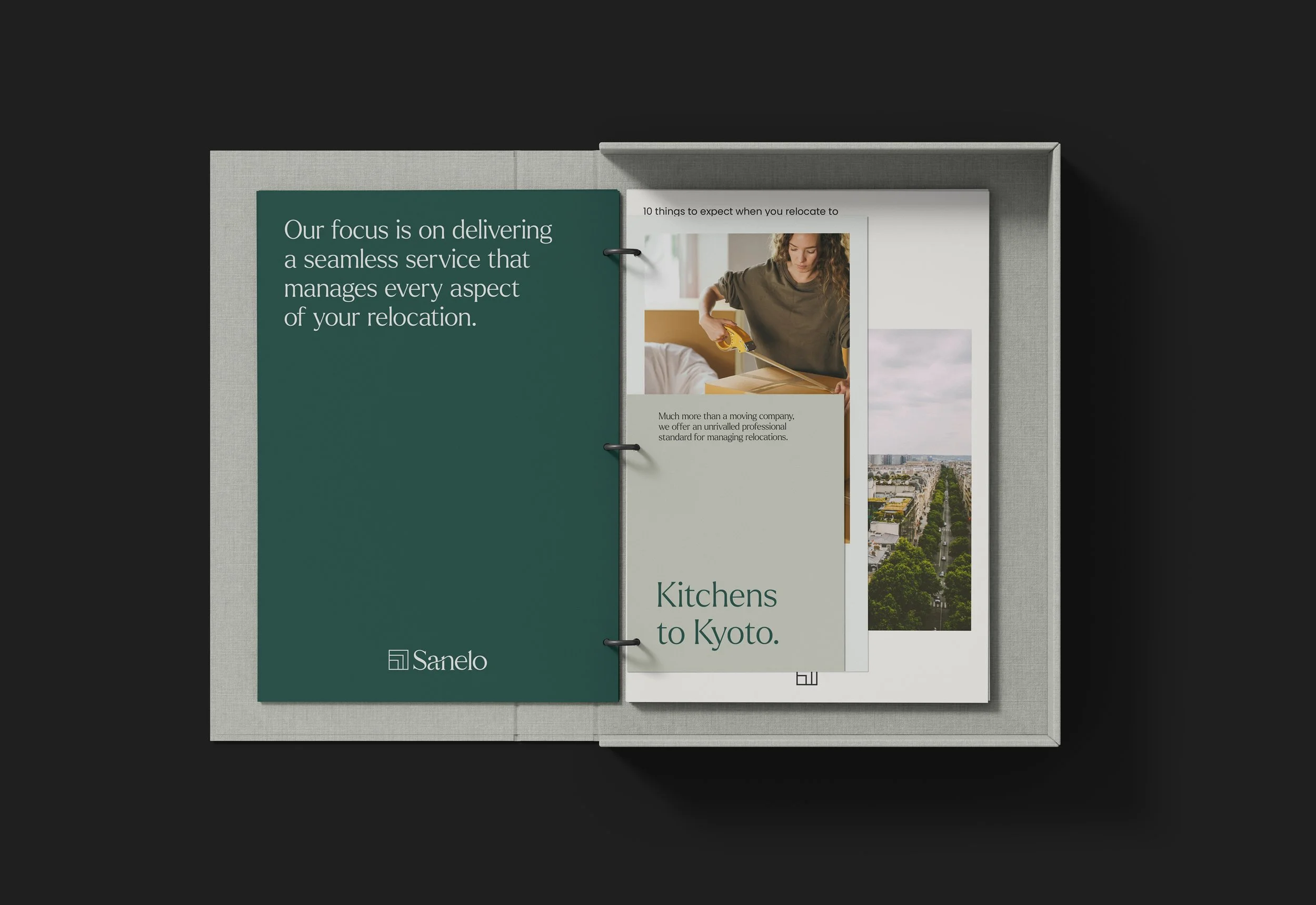
The design process began with the creation of a refined ligature wordmark, coupled with a minimalist logo that encapsulates the dynamic elements of relocations—moving boxes, checklists, paperwork. This design language extends across various brand touchpoints: from the new website to location guides, packing boxes, iconography, art direction, and even custom moving packs.