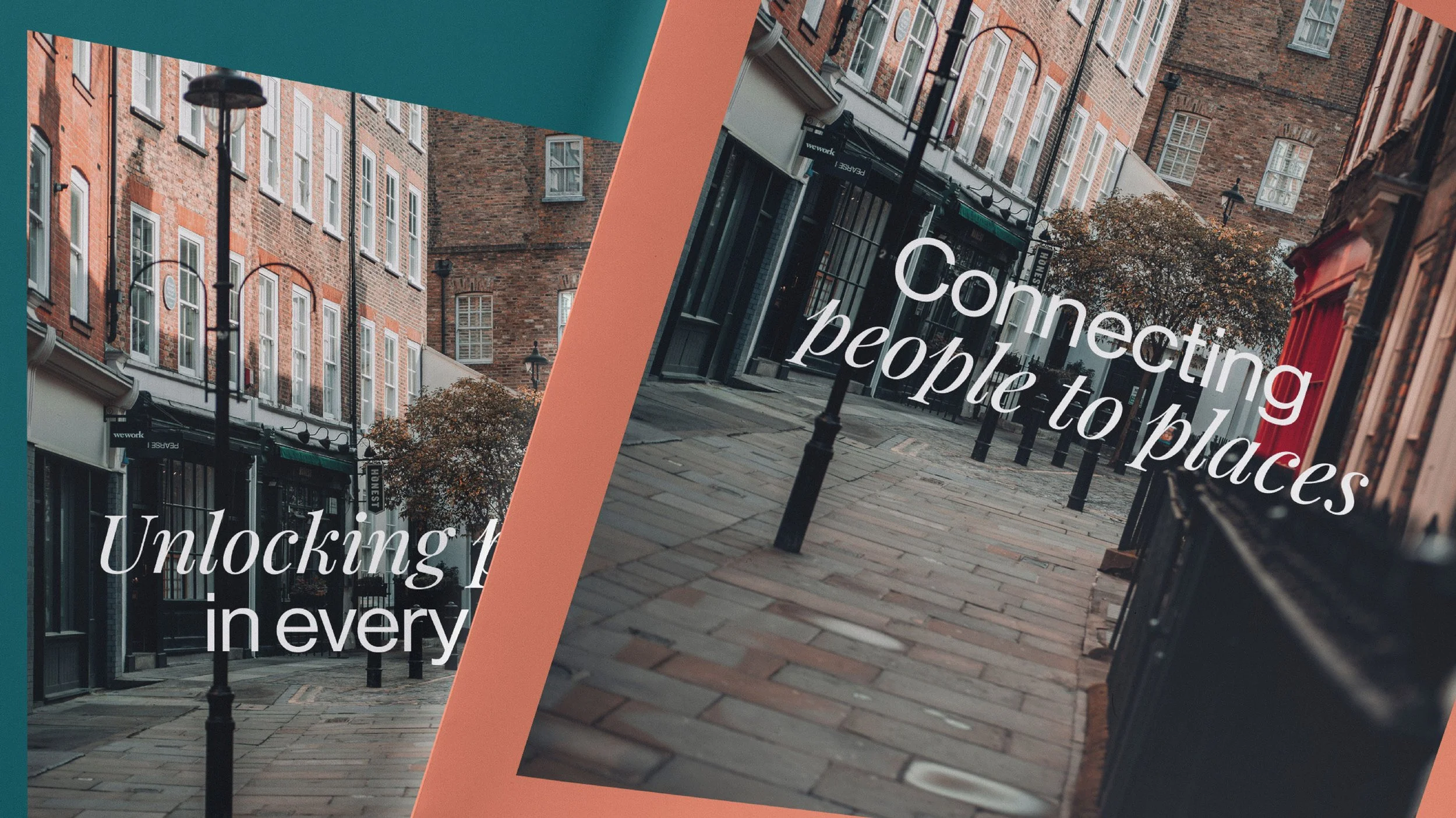
Unlocking potential.
Hanover Green has always been a leader in commercial property consultancy. But leadership is never static. Markets shift. Spaces evolve. What we expect from the places where we work, shop, and invest is changing faster than ever.
Hanover Green recognised this. They came to us with a simple but powerful ambition: to redefine their brand for a world in motion.
We had an aim - to design an identity that speaks to the fluidity of the modern property landscape—one that embodies adaptability, expertise, and the creative potential of the spaces we move through every day.
We started with a belief: great spaces don’t just exist; they are shaped by great minds. Hanover Green doesn’t just manage properties—they unlock their potential. We built a brand to reflect that.
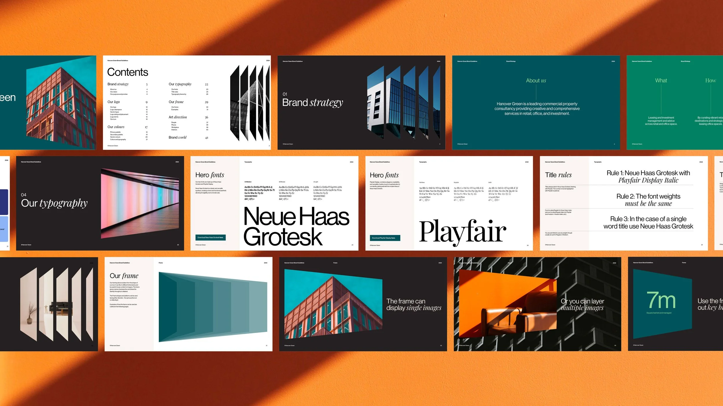
We leaned into a core design principle - dynamism. A brand that adapts and flexes, just like the environments Hanover Green influences. We took inspiration from architectural frameworks, city grids, and the evolving interplay of structure and movement.
Each sector of Hanover Green’s consultancy needed a distinct yet cohesive identity. We used colour to define and differentiate these areas while maintaining a unified brand presence. This system allowed each business area to maintain its own identity while reinforcing the collective strength of Hanover Green’s consultancy. It creates clarity, enhances user experience, and makes navigation intuitive across digital and physical touchpoints.
This wasn’t just a rebrand. It was a redefinition. The new Hanover Green brand is as confident and forward-looking as the company itself. It tells a clear story: this is a consultancy built for the future. Built for what’s next. Since launch, engagement has surged. Clients recognise the shift. The brand has become a tool—an invitation—to rethink what’s possible in commercial property.
A new look. A new voice. The same legacy of excellence.


