How do you create standout in a crowded CBD market?
With dozens of CBD products filling UK shelves, Huna set about the challenge to cut through to consumers. ‘Huna’ is purportedly an ancient Hawaiian philosophy around spirituality and health. The idea for this branding concept was around this idea of the healing power of nature.
The logo
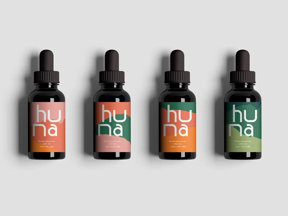
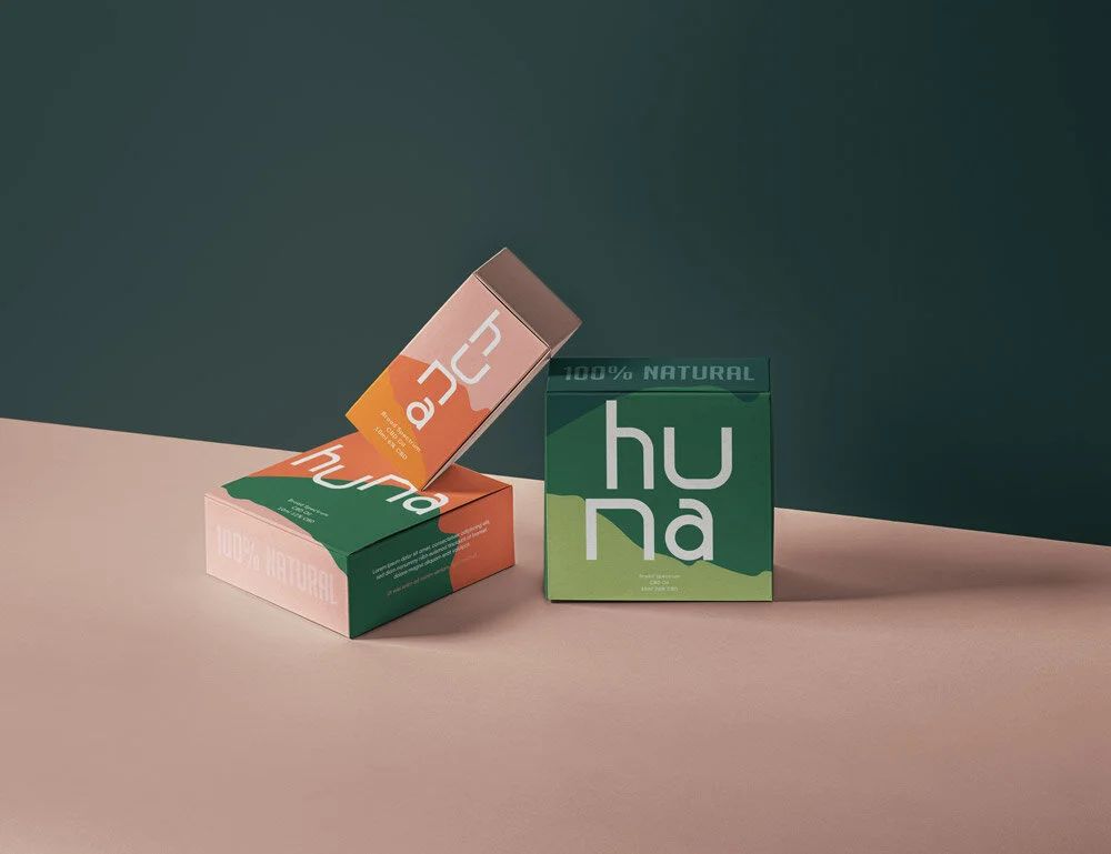
A big barrier to entry for CBD oils is misinformation and misleading comms leading to uncertainty around its safety, particularly in the over 50s market. The identity for Huna looked to soften how CBD products are displayed, more natural and holistic than the often seen sterile, medical branding. I created a playful, disjointed wordmark - its natural flow and soft curves creating a contrast to the pharma style of many competitors.

The colours
The colour palette continues this natural vibe with intrinsically ‘human’ colours, and although associations with hemp can be a tricky line to walk, I wanted to nod to the plants which provide CBD by including green hues. The overall aim was to create a calming, peaceful palette which leads the consumer away from any connotations of being ‘high’ and into the realm of healing. Within the packaging the colour depth increases with the strength of the CBD - from pinks and oranges in the lowest strength range to dark and foresty greens in the highest strength products.


The shapes
The patterns are outlines of Hawaii (from where the term ‘Huna’ originates) layered to create a mountain scene - with the mountains rising as the strength increases. These visual clues to strength and nature add to give a sense of serenity, while giving Huna strong brand recognition and stealing focus on the shelves.